Super Chix
Multiple Locations
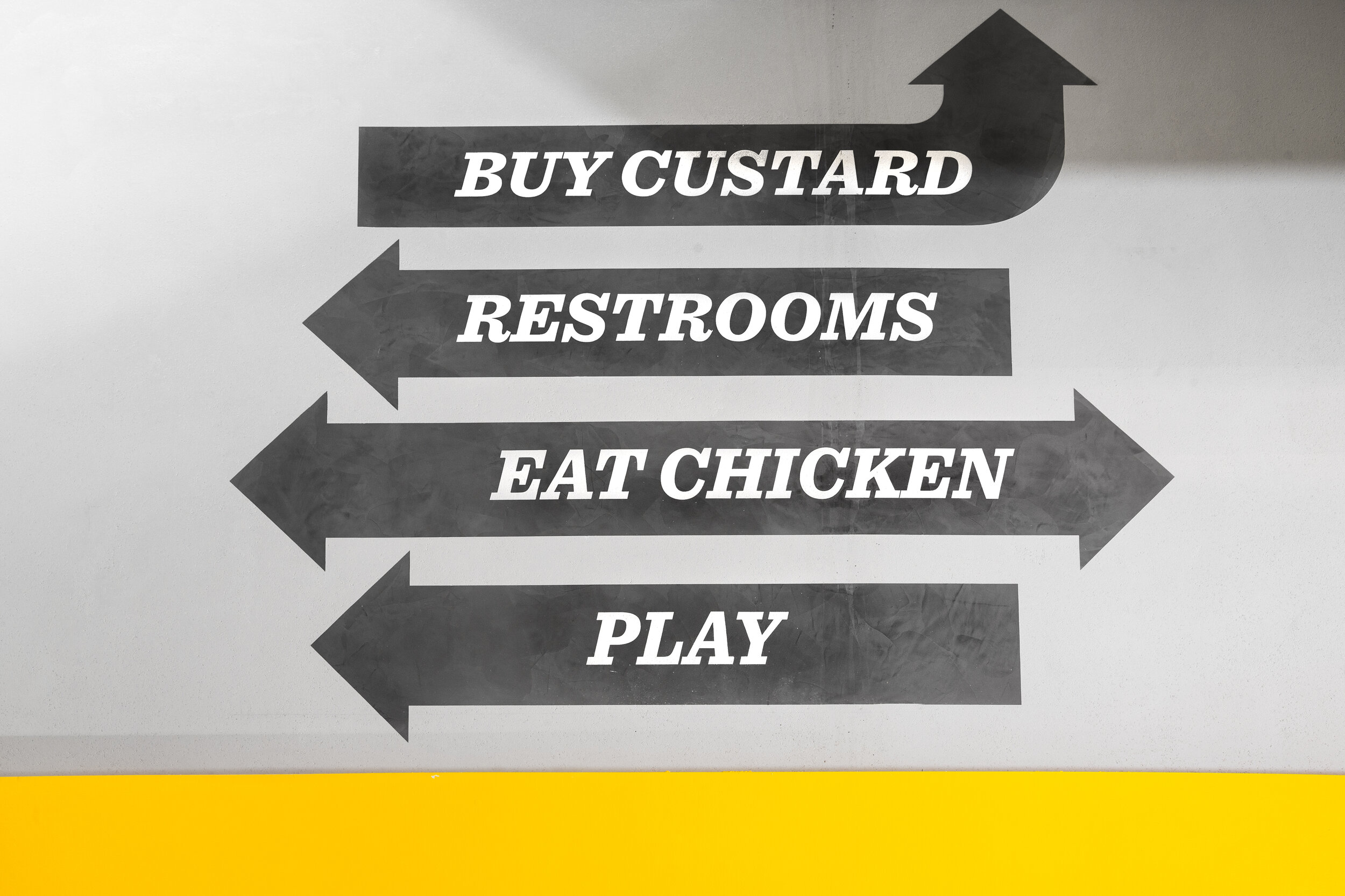
The focal point of the trendy space is the large hand drawn mural featuring illustrated words and sayings, customized by the talented designers and created and installed by local artists. The creative use of material, design and presentation was blended to create a unique and unexpected, kid-friendly adult restaurant experience for every customer.
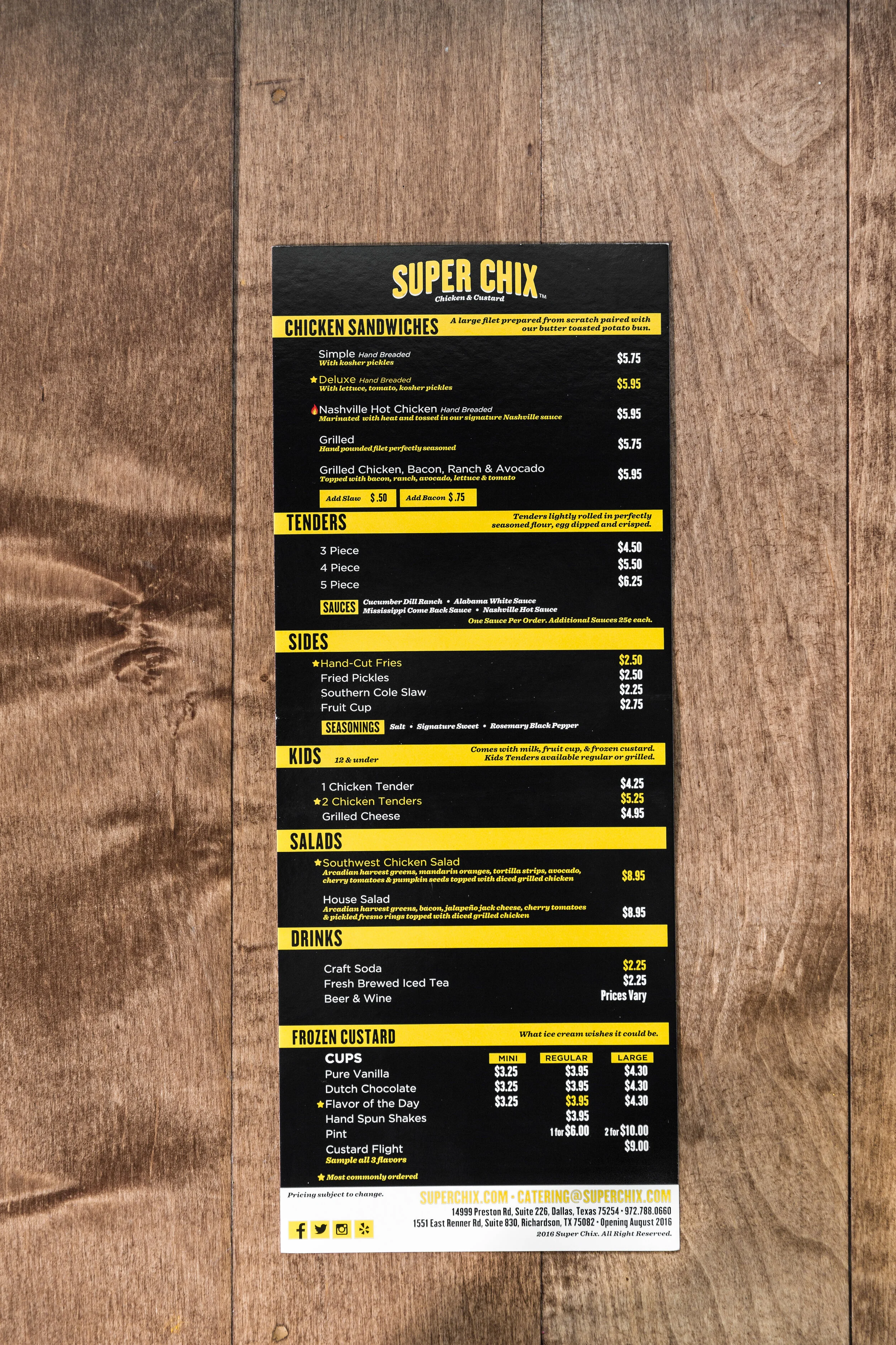
The Super Chix re-brand started with the interiors. From there, the menu boards, wayfinding, take-away menus, interior and exterior signage for the restaurant were created. The restaurant is based on the concept of high-quality family dining, with an atmosphere that is fun for people of all ages and the branding followed the same idea. The color pallet is defined by the edited use of yellow, black and white.